Gold and silver are real sound money! In terms of nominal dollars their prices fluctuate in the market. By taking their price ratio we get a dimensionless parameter the gold-to-silver (Au/Ag) price ratio. What can that tell us about the past and future state of the global financial system?
Here I update the data I have previously published on the gold-to-silver price ratio. See Gold-to-Silver Ratio Predicts a Coming Crash. Please read that as an introduction.
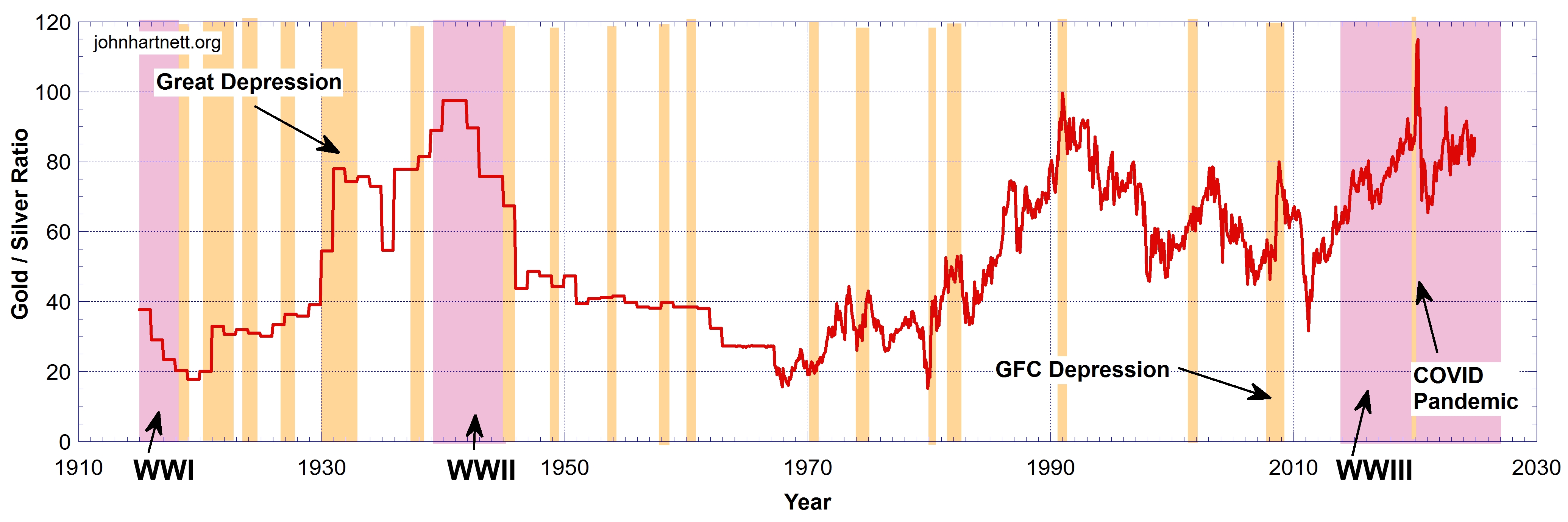
Chart 1 shows the gold-to-silver price ratio from 1914 to this month 2024 derived from US prices. After August 1971 the ‘gold window’ was closed and the prices of gold freely fluctuated in the market as compared with the period before 1971 when the price of gold was controlled.
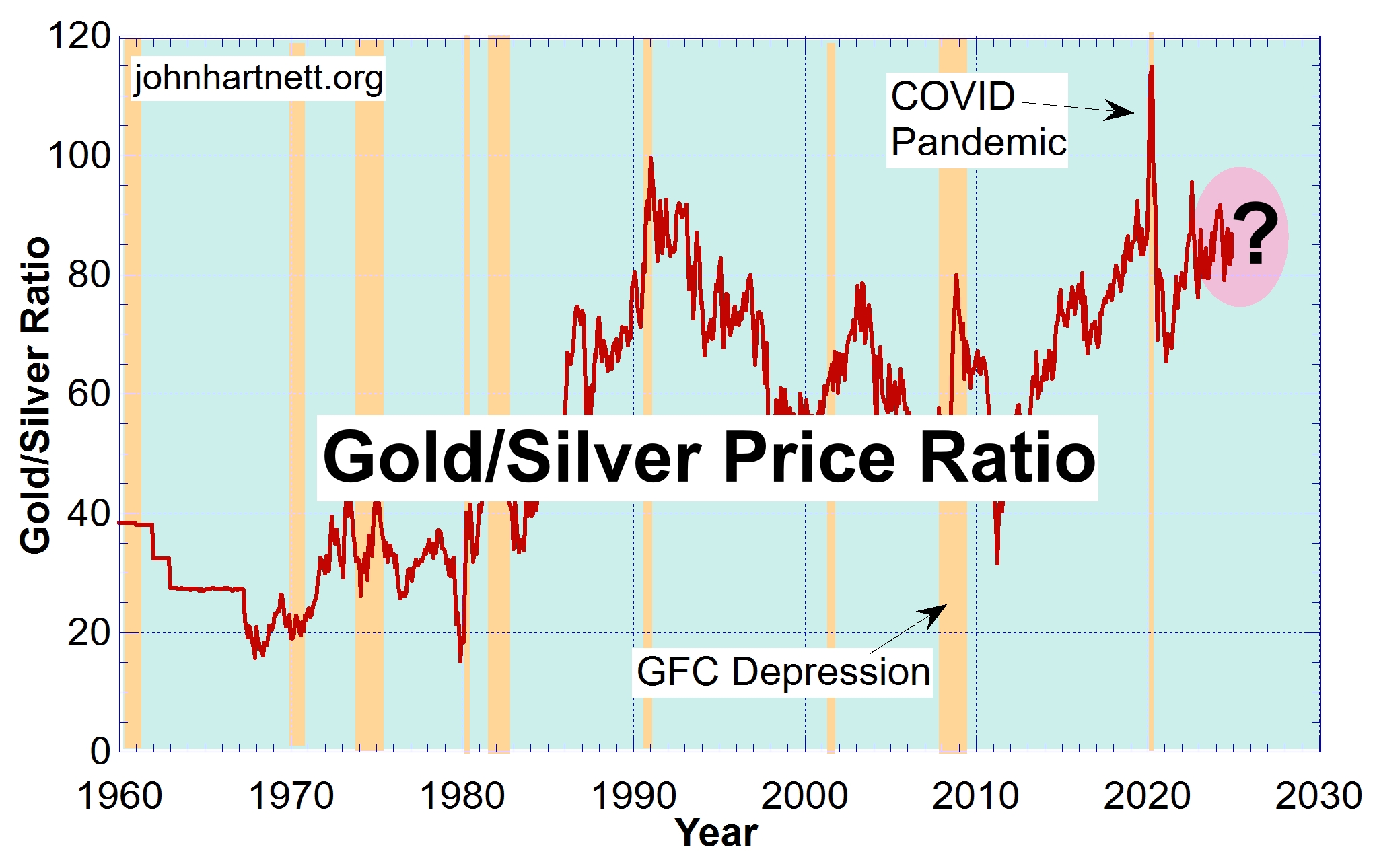
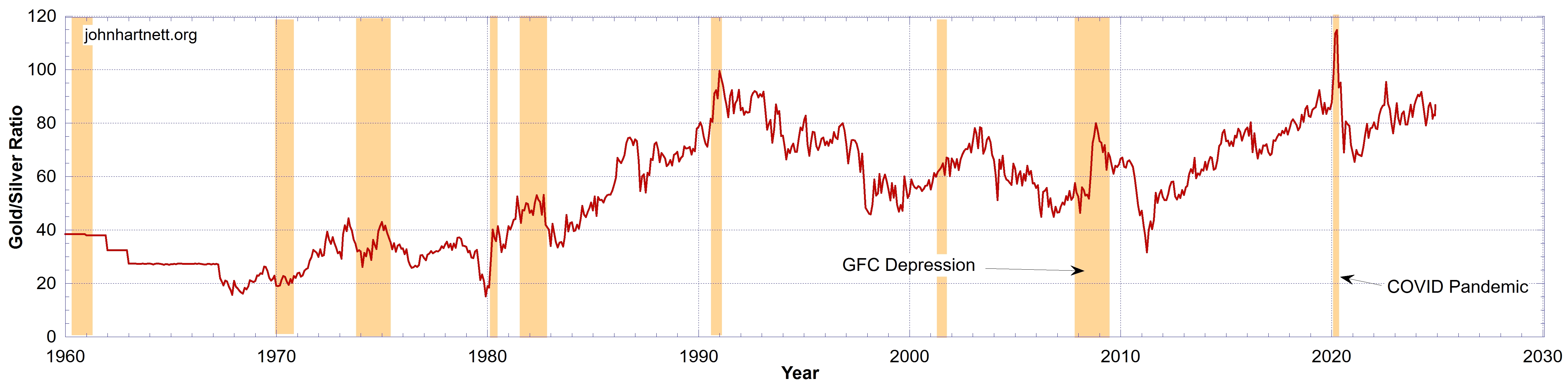
By zooming in to the period above 1960 it is easier to see the fluctuations in the Au/Ag ratio as shown on Chart 2. Note how they correlate with recessions indicated by the sepia strips. The Au/Ag ratio rises rapidly into a recession.
In order to quantify how quickly the Au/Ag ratio changes I have taken the Derivative of that ratio as a function of time and show it on Chart 3. The Derivative then quantifies the rate of change or what I’ll call the “velocity” of the Au/Ag ratio.
Looking from left to right on the chart, you’ll notice a rising trend in the magnitude of the Derivative, either positive or negative. This is indicated by the height of the “grass growing” as time proceeds (to the right). To me that indicates a rising instability in the price ratio.
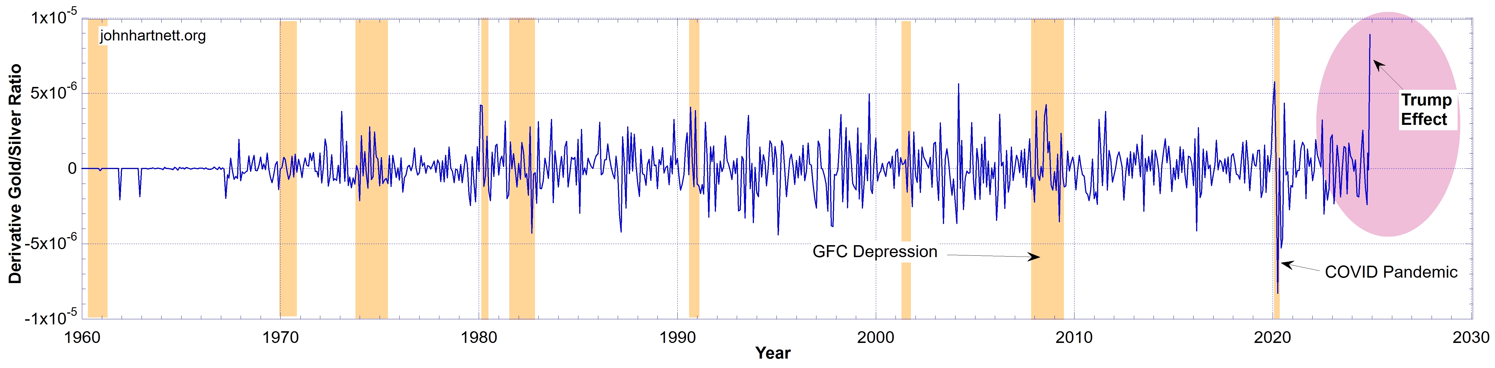
One special feature in particular is seen as a significant “velocity” of the Au/Ag ratio in the month of November 2024. I have labelled it the “Trump Effect” because after the election of President Trump there was a big pull back in the gold price, which has quickly regained about half of its losses.
However I have a doubt about this because it occurs right at the end of the data set where a sampling artefact can be introduced when taking the derivative numerically. Even so I have sampled the data weekly for the last 3 months but only after another month or two of weekly data can we be certain it is a real effect. However I’ll proceed on the assumption that the “Trump Effect” shown here is not a sampling error. Time will tell.

Chart 4 is a double Y plot with both the Au/Ag ratio and the Derivative or “velocity” shown for the period 1914 to November 2024. Prior to 1971 very discrete price changes to gold and silver were made so it looks very step wise. Nevertheless during the period some rapid changes in prices occurred causing a strong negative or positive Derivative.
During the Great Depression the Au/Ag ratio changed very quickly as indicated by the label “Great Depression”. Please note the height of the Derivative peak (blue data) on Chart 4 labelled “Great Depression” as compared to the height of the Derivative peak labelled “Trump Effect”. They are about the same value. Also these are both of the same magnitude, but of opposite (negative) sign, as the Derivative during the COVID Pandemic.
Therefore it would seem that Depressions are indicated by large “velocity” effects in the Au/Ag ratio, whether they be of positive or negative sign. One more event had a large negative Derivative. It occurred at the end of 1945 with close of World War II and the depression at that time.
Based on those past references it would seem that we are now very close to a significant Depression if we can believe that the Trump Effect on the Au/Ag price ratio is real. But all other indications are that the dollar is dying and as such the gold to silver ratio will be a significant indicator.
Related Reading
The Trump Effect | Gold and Silver Price Predictions Updated
Free Subscribers
Subscribe to our Newsletters as a Free Subscriber and be notified by email. Just put your email address in the box at the bottom of your screen.
You’ll get an email each time we publish a new article. It is quick and easy to do and totally free. You only need do it once.
Premium Subscribers
Subscribe to our Newsletters as a Premium Subscribers at $5 USD/month or $30 USD/year (you choose).
Paid Premium Subscribers will get exclusive access to certain content I publish. That will only cost you a cup of coffee per month.
This is how you can support my work. I have been publishing this website for 10 years now and up to 2024 I never asked for any support.
Press the button “Premium” on the front page to find a list of Premium content. Thanks so much to all supporters.
At a minimum, please join as a Free Subscriber. It’ll cost you nothing. It may also help me beat the shadow banning of some posts.