

As of July 1, 2024, the US National Debt had risen to $35.46 Trillion the highest level in history according to Federal Reserve Economic Data, Federal Reserve Bank of St. Louis, updated December 11, 2024. However I found a datum value for the 3rd quarter 2024 on Statista, which indicates that the National Debt actually fell a little to $35.25 Trillion.
Chart 1 presents the US National Debt from 1966 to 2024, sampled quarterly.
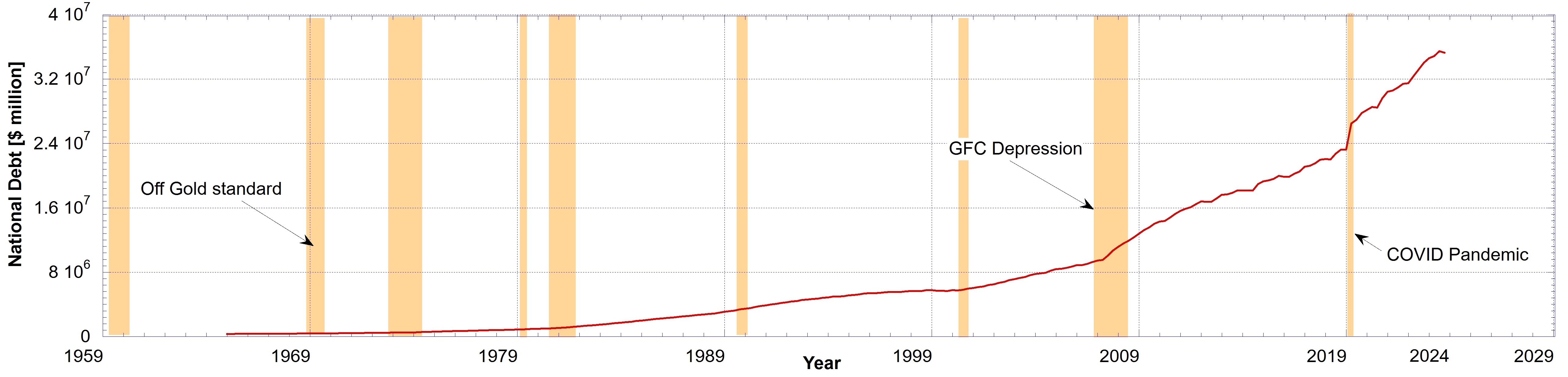
Note the very rapid increase in the National Debt in the first quarter of 2020, with the helicopter “money printing” of the COVID Pandemic. A smaller increase is see during the GFC banking crisis.
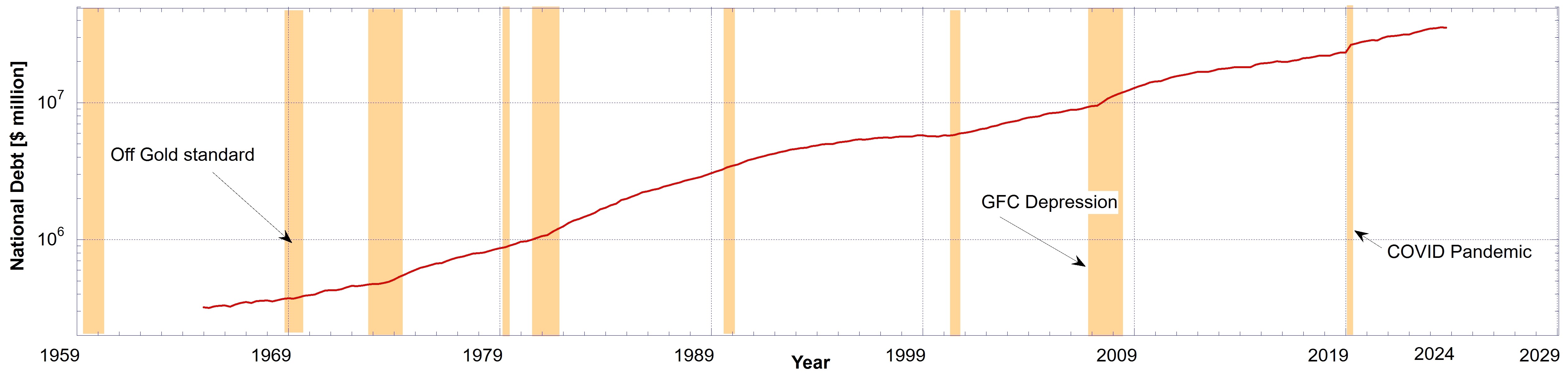
On a linear scale it is easily seen that the growth in the US National Debt is exponential. On a log scale plot an exponential curve is a straight line. This is shown below on Chart 2 with a logarithmic scale.
You would think a $35 Trillion debt would send the nation bankrupt. Afterall it is about $120% of GDP. But when we look at the derivative, or the rate of change, of the National Debt, the red curve in Charts 1 and 2, things get very interesting.
I numerically took the derivative of the data represented in Charts 1 and 2. The result is presented in Chart 3, in units of $ millions per second.
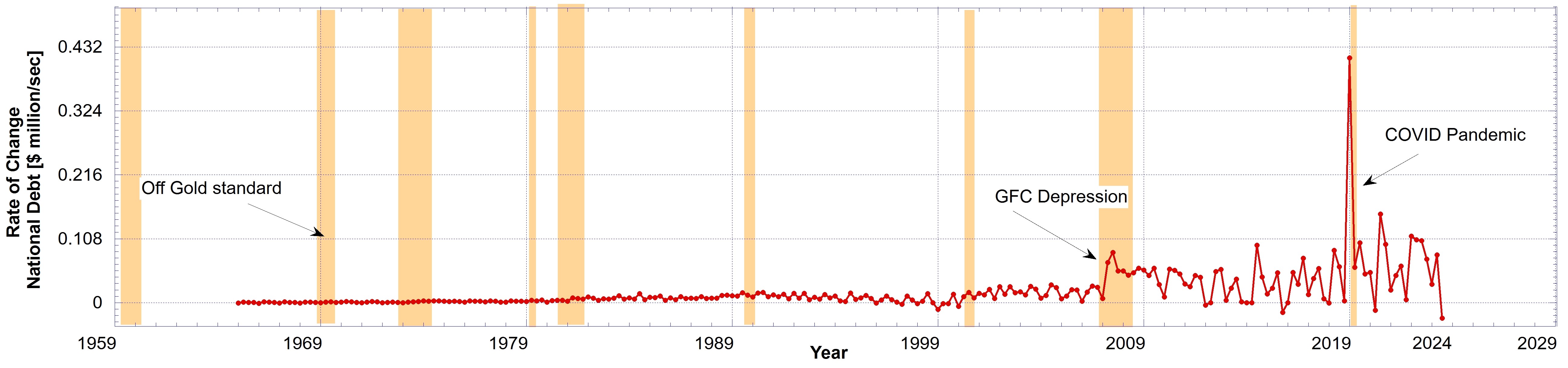
This means that at the peak of helicopter “money printing” for the COVID relief the Fed “printed out-of-thin-air” $0.414 million per second in January 2020, that is, $414,000 per second. Wow! I sure wish we could do that, with the push of a button. Well, not really!
Looking at Chart 3, note the rate of change of the debt, and it has nearly always been an increase, even though fluctuating up and down. Only a few times was there a decrease in the debt. But notice (left to right) with time advancing from 1966 that quarterly increments have been growing larger and larger.
Perhaps a better and fairer way of presenting this data is with the fractional change year over year. This means looking at the percentage change in the debt from one quarter to the next. This way the fractional change takes out the effects of dollar devaluation over time.
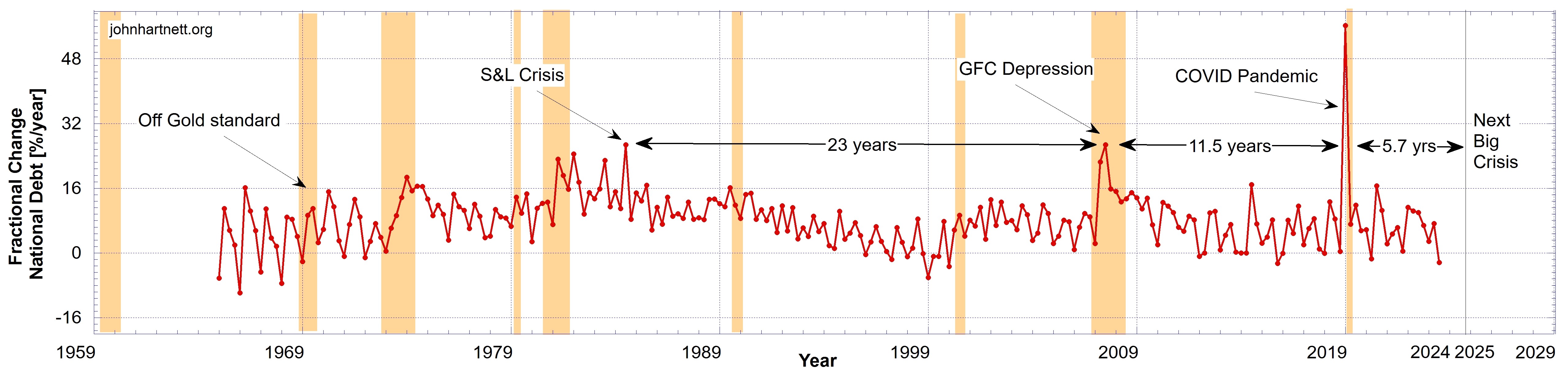
Chart 4 results. This chart means we are comparing “apples with apples” for all time periods shown. It shows us that the changes, mostly increases, in National Debt were very comparable since 1966 except for a few notable exceptions, which we discuss below.
Note the peak in 2020 for the COVID pandemic. The first quarter showed a $3.2 Trillion increase in debt, from $23.2 Trillion of the last quarter of 2019. If we take that as a percentage and annualize it, since it occurred over a 3 month period, we get a 56% increase in that 2020 quarter. If the Fed had continued the same rate of helicoptering “money” for the whole year of 2020 it would have represented a 56% increase in the National Debt.
By comparison, in the 3rd quarter of 2008 at the peak of the GFC banking crisis the annualized increase in the National Debt was only 26.7%. However in the 3rd quarter of 1985 the National Debt was also expanded by the same percentage of 26.7%. Was this the year of the peak in the Savings and Loan (S&L) financial crisis?
It took 23 years, from 1985/7/1 to 2008/7/1, up to the GFC banking crisis, for the US to suffer another financial crisis on the same scale as the S&L crisis with a 26.7% expansion of the National Debt.
But it took only 11.5 years, from 2008/7/1 to 2020/1/1, for the US National Debt to suffer another financial crisis, but this time 2.1x the GFC crisis or a 56% expansion of the debt.
We note that 11.5 years is half of 23 years, so extrapolating the time interval as again half of 11.5 years, we get 2025/7/1 or 5.7 years after 2020/1/1, for the Next Big financial Crisis. All these time intervals are indicated on Chart 4.
I don’t have the data for the National Debt before 1966 but what is curious in these time intervals is that if you extrapolate backwards in time double the 23 years, i.e. 46 years, you get 1939/7/1. What financial crisis happened then? I don’t know but I do know that that is when World War II started and all wars are bankers wars.
So here is a prediction based on the time intervals between major financial crises and the rapid expansion of the US National Debt.
Some time around July 2025 we should expect the next major round of “mad money printing” with a major financial crisis. That is only 8 months from now.
Even if the Next Big Crisis brings on a debt expansion of 56%, the same fractional percentage increase in debt as 2020, it will be, in fact, much bigger because the nominal amount of the National Debt has been and still is growing exponentially.
Get prepared for the next crisis! This next one may make the previous financial crises seem like nothing.
Related Reading
- US National Debt Compared to Gold and Silver Prices
- The US National Debt Predicts Gold and Silver Price Break Outs
- Is the Gold-to-Silver Ratio Predicting Another Great Depression?
Subscribe
Free
To be notified by email put your email address in the box at the bottom of your screen. You’ll get an email each time we publish a new article.

Premium
Subscribe to our Newsletters as a Premium member ($5 USD/month or $30 USD/year) and get a free PDF of my book Apocalypse Now, which you can download from a Premium members only post here.
Paid Premium members will get exclusive access to certain content I publish, which I expect to be about 4 exclusive posts per month.