
The question is how high are the prices of gold and silver going in this current bull run, which started in the beginning of 2024? It is a good question, which we all would like to know the answer to. In the following I analyse with charts where we have gotten to at the moment and I speculate where those prices will be by the end of 2026. If both gold and silver prices continue to follow their current trajectories, by the end of 2026, the price of gold will be $4800/oz and silver will be $60/oz.
Recently I worked with my friend Chris Marcus of Arcadia Economics and helped him with several charts for his 100 page Arcadia Silver Report (see below). You can also find Chris’s commentary on his excellent YouTube channel (https://www.youtube.com/@arcadiaeconomics).
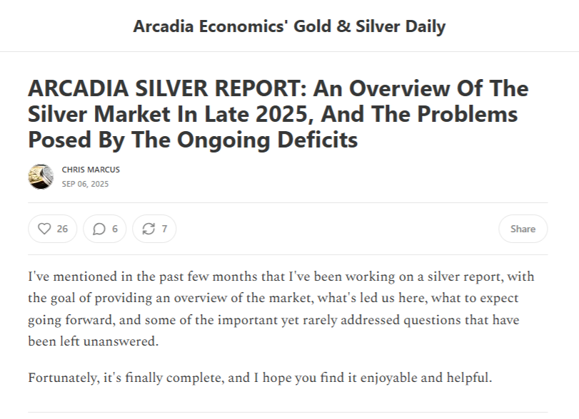
https://goldandsilverdaily.substack.com/p/arcadia-silver-report-an-overview
The charts that you will find in that report I have reproduced below.
Chart 1 compares the price of gold with price inflation due to the US official CPI and the M2 money supply from to the Federal Reserve. To represent these on the same chart the latter two have been normalised to the price of gold in 1971 of $35.60.
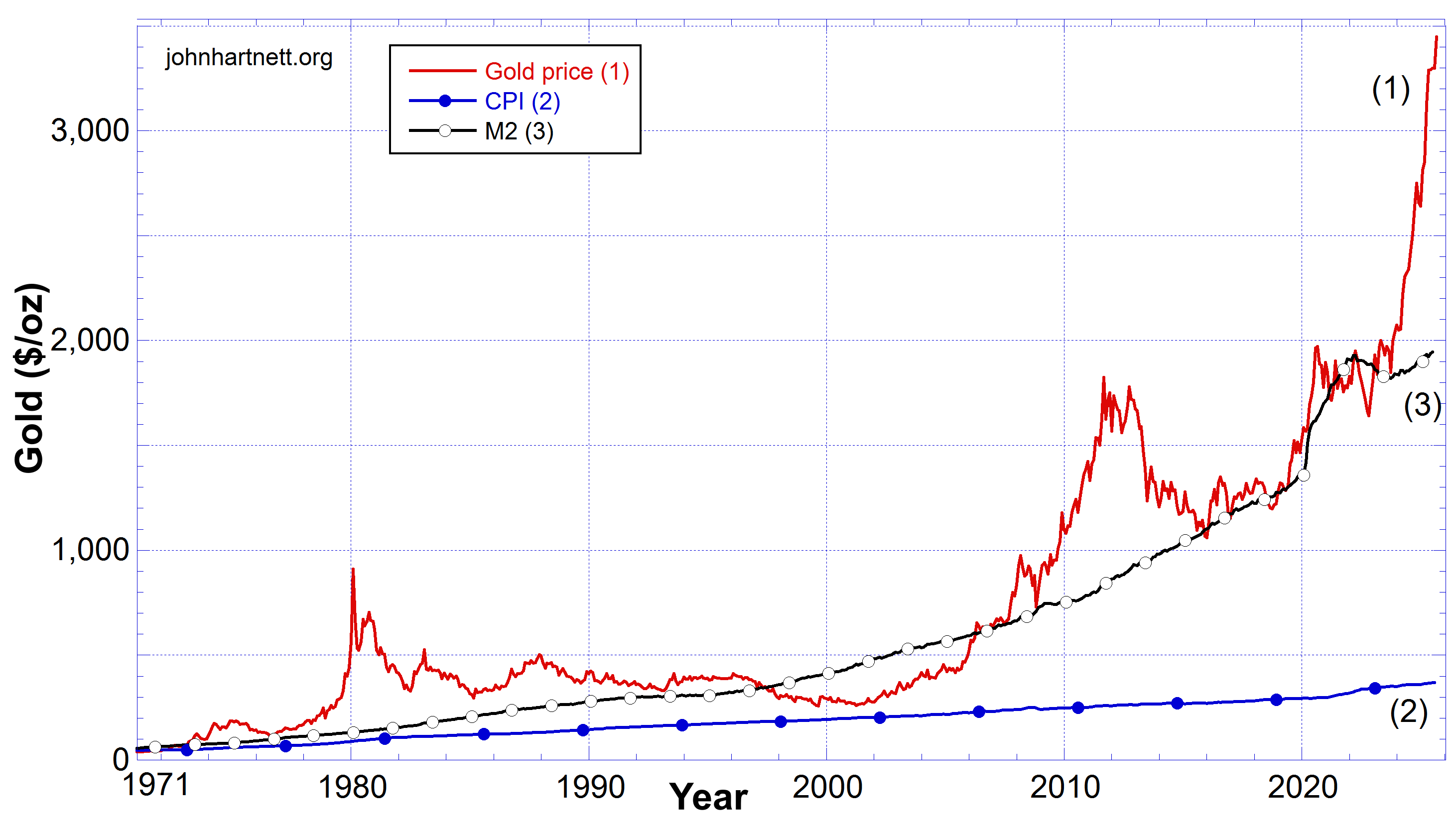
The true measure of dollar devaluation and hence price inflation is the expansion of the M2 money supply. But even compared to that the price of gold outstrips all secular measures of price inflation.
The same cannot be said for the price of silver. See Chart 2 below. In that chart the three are compared from 1964 when silver was $1.29 per ounce. Again the growth of the CPI and the M2 money supply were scaled to this figure so they could be properly compared.
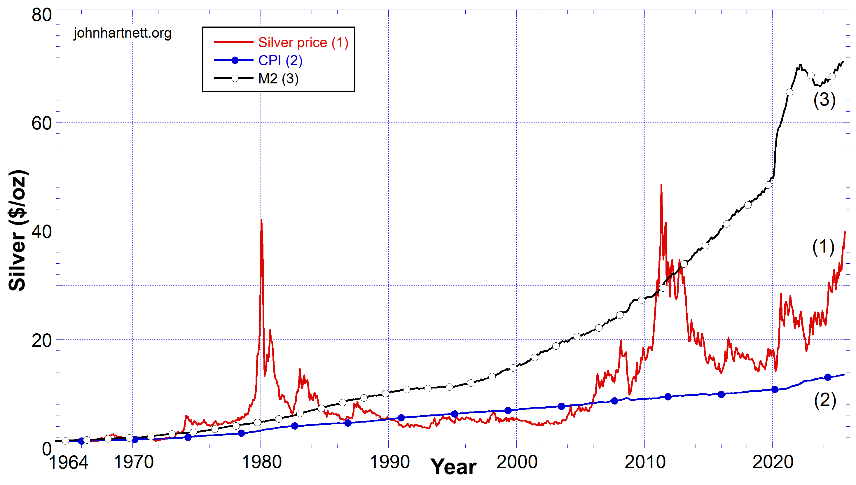
The silver price has remained above the price inflation due to the official CPI figures but well below that due to the M2 money supply growth over most of the period shown. This means silver is extremely undervalued and is very cheap.
It sure looks like silver is an excellent buying opportunity now that the silver price has broken above $41 as of today ,September 8, 2025.
The following Chart 3 compares the prices of gold and silver on a double Y plot from 1964 to August 30, 2025. In 1964 silver was $1.29/oz and gold was 35.25/oz.
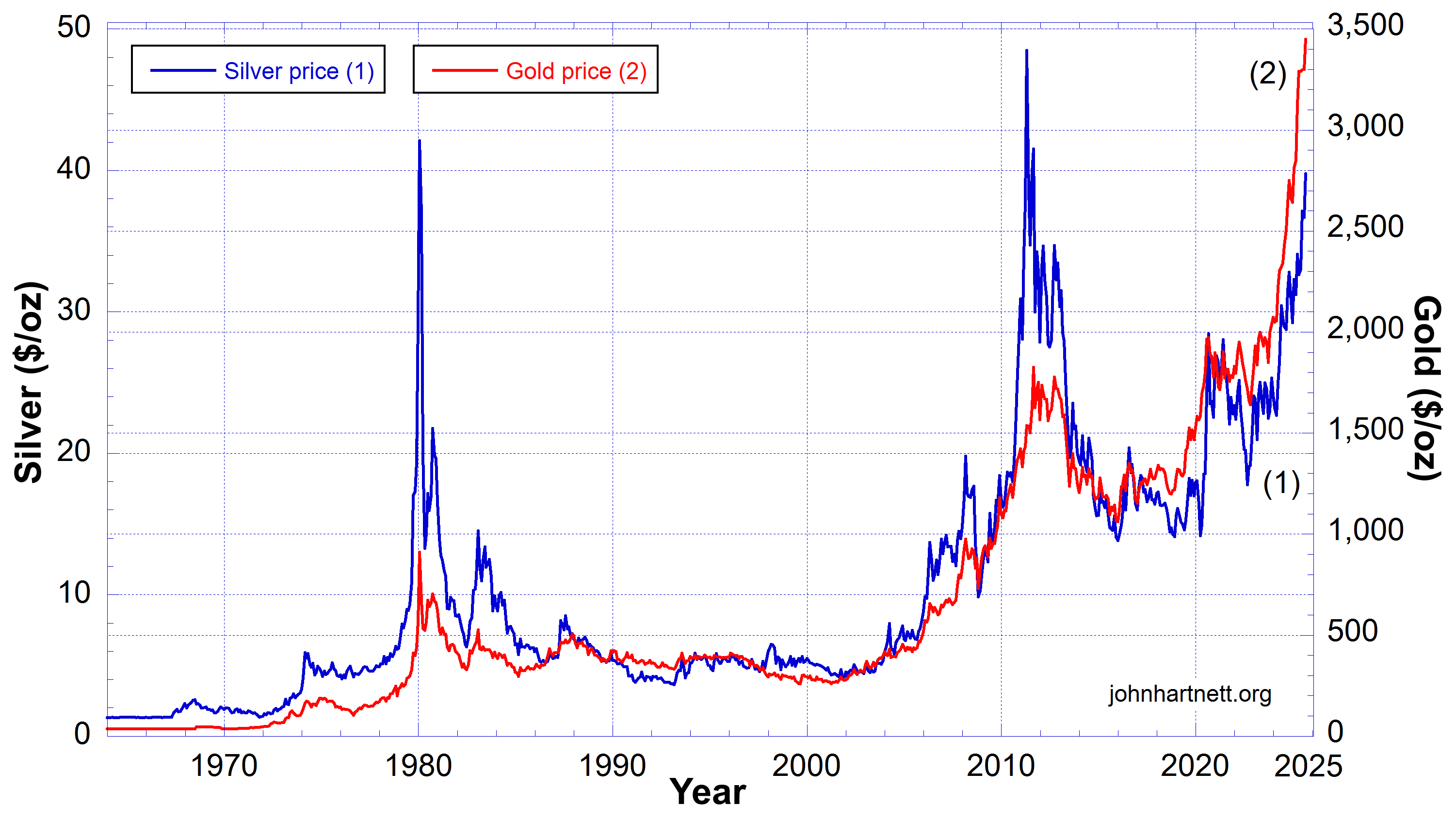
Chart 4 is the same data but only for the range January 2024 to August 30, 2025.
Here it is obvious that over this period, in percentage terms, that gold and silver have performed very well. What is significant is the massive increase in silver in this last year. Only two times in the last 60 years did silver outperform gold, in 1980 and 2012.
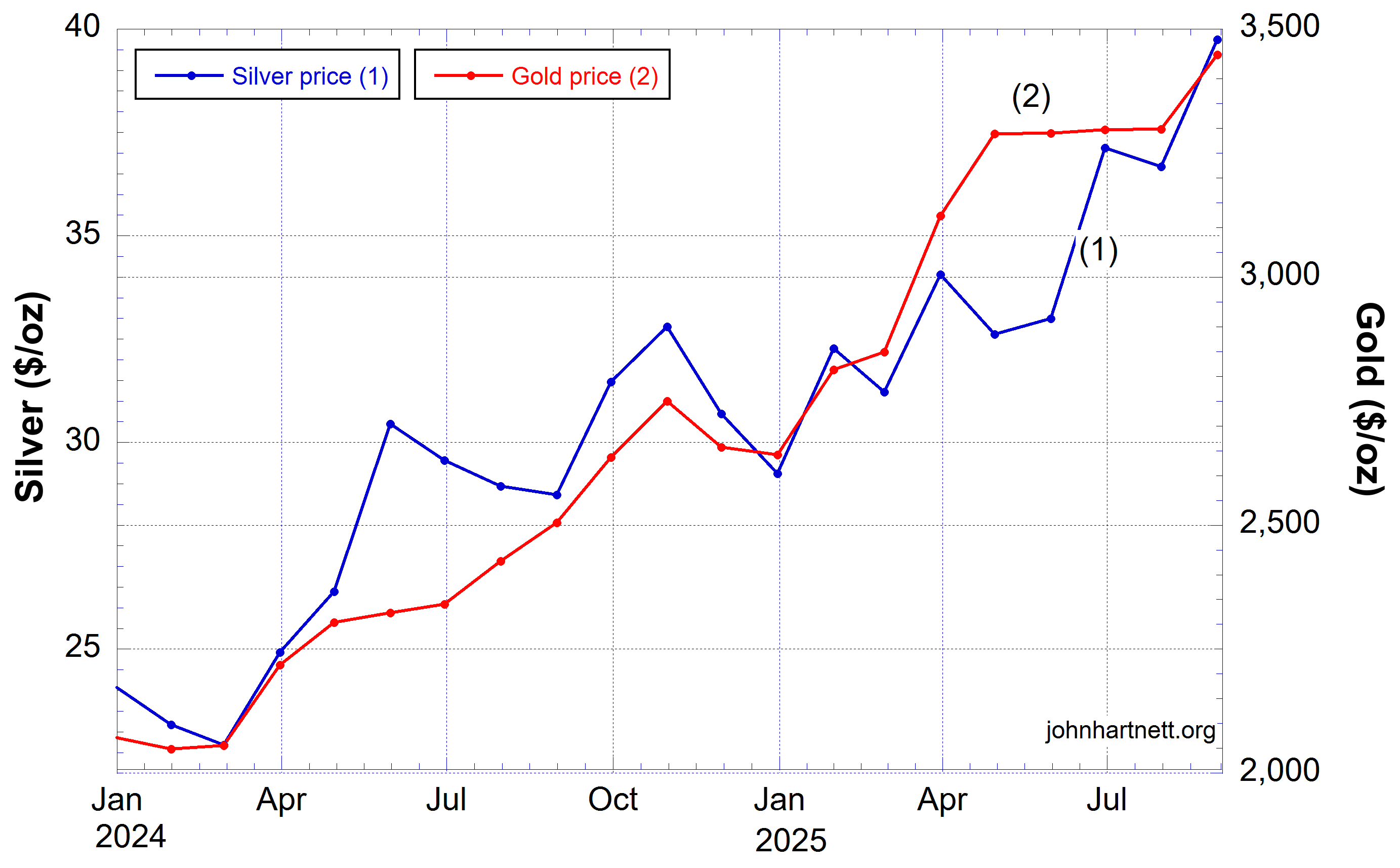
I have been watching the price of silver for about 9 years after it bottomed in 2016 and except for the post-2020 (COVID plandemic) jump it has been pretty flat, well … until the beginning of 2024. I was surprised to see the exponential growth in price since then. Gold also is on an exponential growth trajectory, which is slightly stronger than that for silver.
If both continue to follow their current exponential trajectories, by the end of 2026, the price of gold will be $4800/oz and silver will be $60/oz.
Chart 5 compares the prices of gold and silver to the values of three stock market indices, the Dow Jones, the S&P500 and the NASDAQ by scaling them to the price of silver in 1964. This used a scale factor for each, which are shown at the top of the chart.
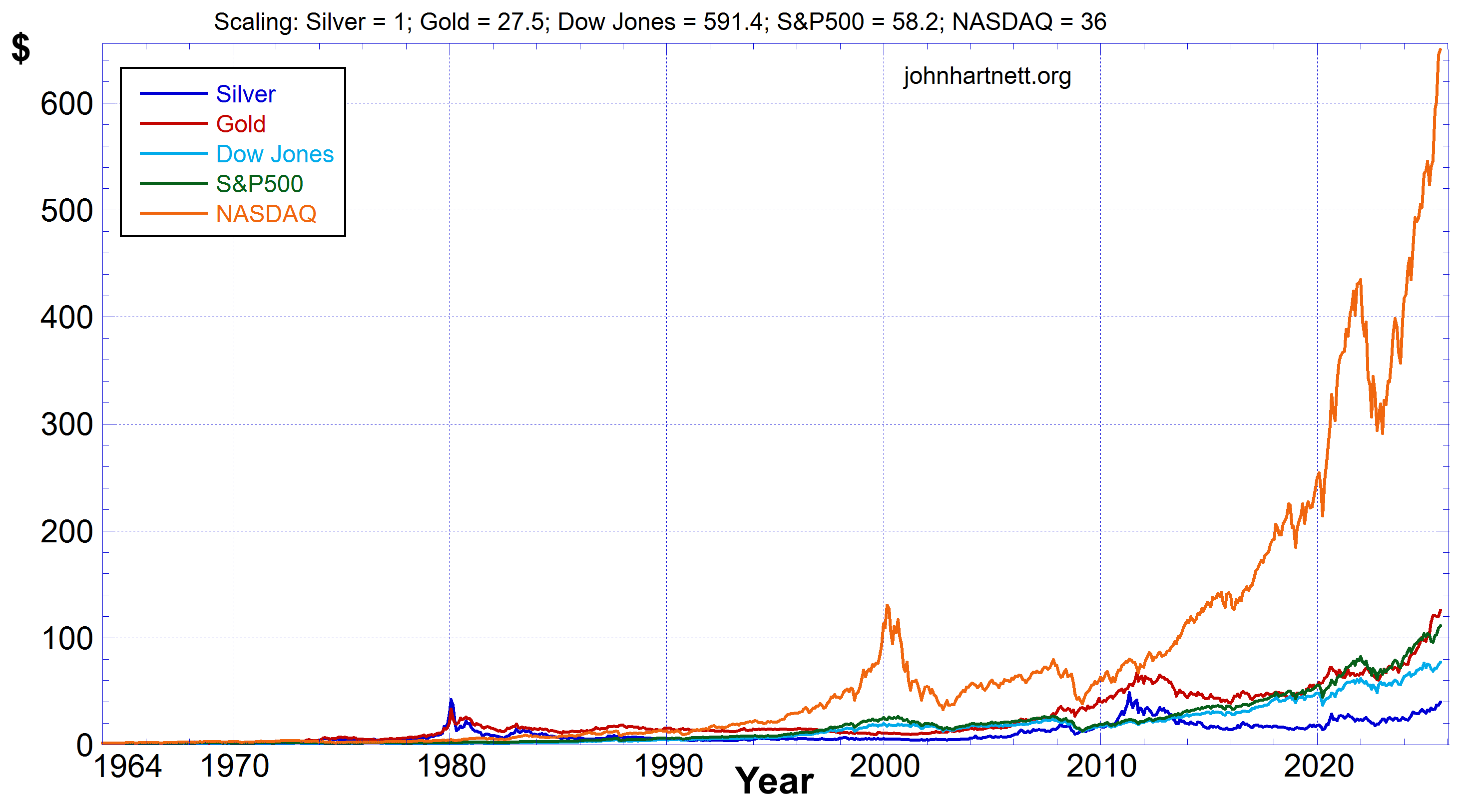
Over this time period silver has been the worst performer of the 5 shown. That is expected as it is very undervalued. However gold has performed well and slightly outperformed the S&P500 over the time period shown. The NASDAQ clearly has been the big winner. But has that been true recently?
Chart 6 shows the same comparison as Chart 5, but only since 2000.
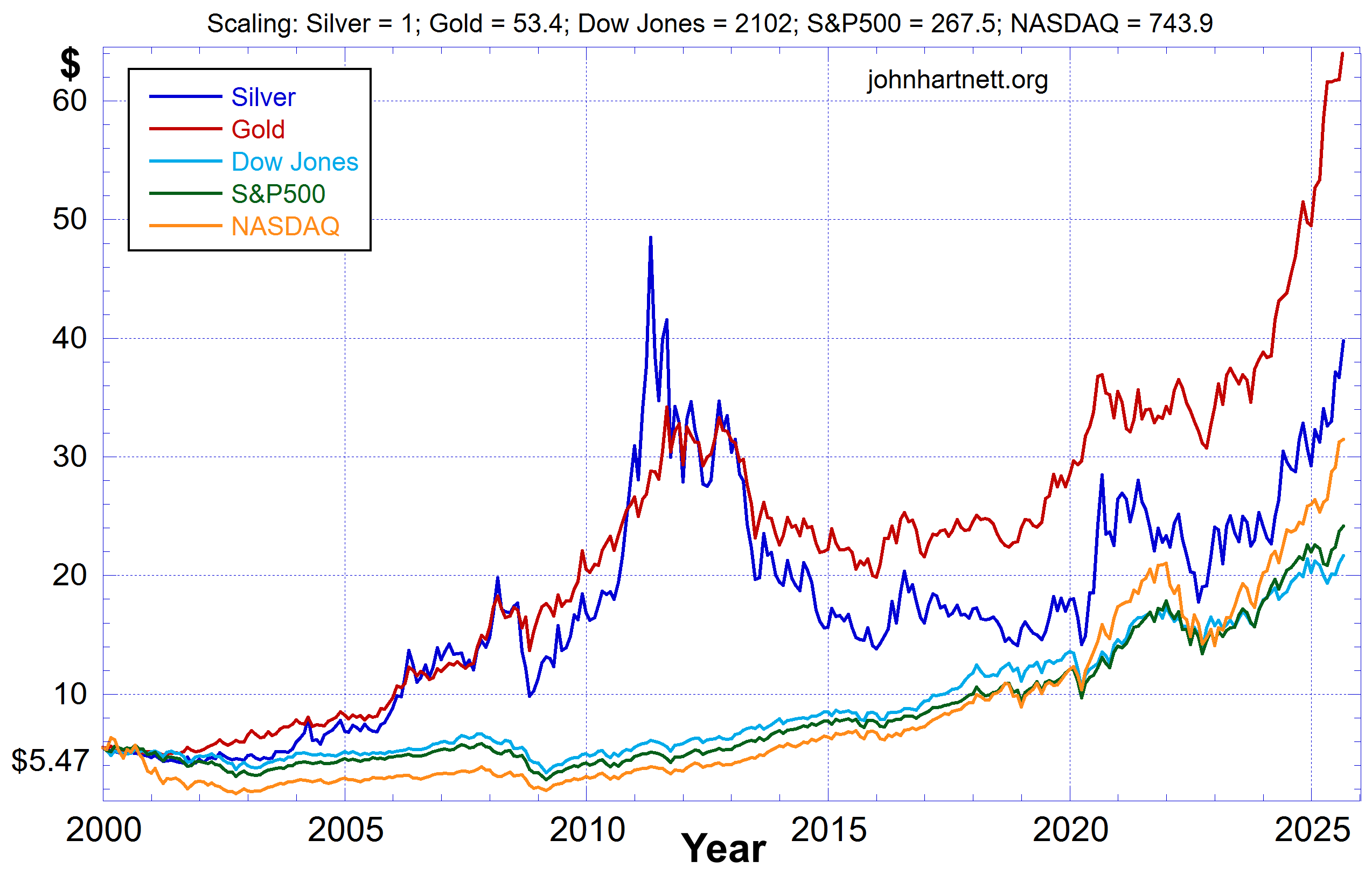
Chart 6 compares the prices of gold and silver to the Dow Jones, the S&P500 and the NASDAQ from the beginning of 2000 to August 30, 2025. In percentage terms it is clear that gold has been the winner with silver following behind and ahead of the NASDAQ.
I believe that gold and silver are the assets of choice at the moment. Both are on exponential price growth trajectories and both are outperforming the equities indexed in the Dow Jones, the S&P500 and the NASDAQ. You be your own judge!
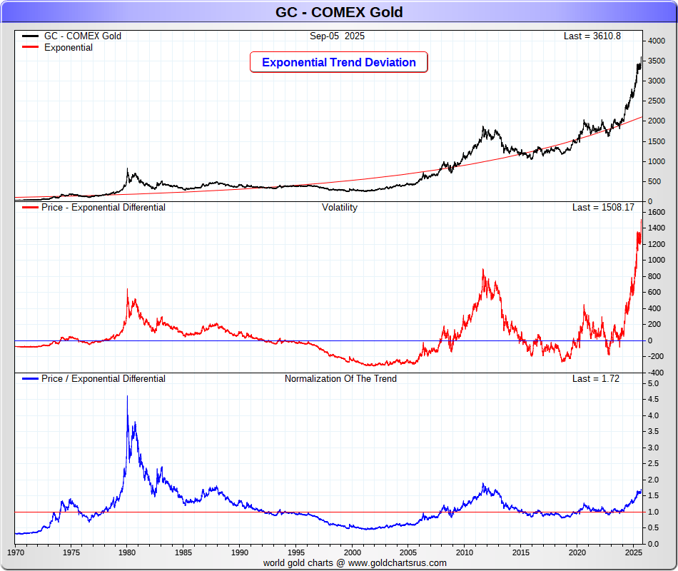
Nick Laird of www.goldchartsrus.com implemented my suggestion which strips out the exponential growth of price increase due to the M2 money supply dollar deflation and leaves you with the price volatility around that exponential trend (middle plot) and the price normalised to constant dollars (bottom plot). The latter tells us that gold is still very undervalued (bottom) even though the price has broken out above the exponential trend line (middle).
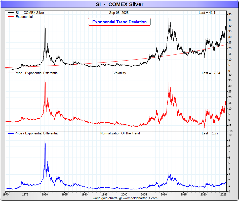
The same analysis for silver tells us that (a) silver is undervalued (bottom plot) and (b) that the price has broken out from the exponential trend line (middle plot), but has a long way to go to equal its 2012 value. So where is it going now? Looks like ….. up!
Related Reading
https://biblescienceforum.com/?s=gold+silver
Free Subscribers
Subscribe to our Newsletters as a Free Subscriber and be notified by email. Just put your email address in the box at the bottom of your screen.
You’ll get an email each time we publish a new article. It is quick and easy to do and totally free. You only need do it once.
Premium Subscribers
Subscribe to our Newsletters as a Premium Subscribers at $5 USD/month or $30 USD/year (you choose).
Paid Premium Subscribers will get exclusive access to certain content I publish. That will only cost you a cup of coffee per month.
Also you’ll be able to download, for free, a PDF of my book Apocalypse Now and also a PDF of my book Physics of Creation The Creator’s Ultimate Design for Earth.
You can download them from the link below.
This is how you can support my work. I have been publishing this website for 10 years now and up to 2024 I never asked for any support.
Press the button “Premium” on the front page to find a list of Premium content. Thanks so much to all supporters.
At a minimum, please join as a Free Subscriber. It’ll cost you nothing. It may also help me beat the shadow banning of some posts.


Leave a comment