Central bank interest rate setting to inflate the dollars they ‘print’ is the biggest financial crime ever perpetrated on mankind, at least in the modern age. The central bankers print the IOU debt-based notes then deflate their purchasing power by artificially controlling interest rates above zero. To pay the interest on the credit extended by the banks more currency printing is needed, which leads to continued devaluation of the currency unit. Hence price inflation.
Former governor of the Bank of England, Lord Mervyn King, admitted that the soaring inflation and living costs experienced worldwide post-COVID were a predictable result of ‘money’ printing by the central banks.
“During Covid, when the economy was actually contracting because of lockdown, central banks decided it was a good time to print a lot of money. That was a mistake. That led to inflation. We had too much money chasing too few goods, and the result was inflation. That was predictable. It was predicted and it happened.”
Source at 6:30 minute mark.
However when the official US CPI inflation rate is compared to the dollar deflation by the issuance of credit, seen in the M2 money supply, a major mismatch results. CPI inflation underestimates true inflation possibly by 60% on average. It does not account for all price increases. From the hard evidence of the historical price of gold over the last 65 years we conclude that gold is money and fiat dollars are not. Gold has maintained its buying power whereas the fiat US dollar has lost about 98% of its value since 1959.
In the following we compare 2 methods for devaluation of the dollar and hence price inflation: the rate of expansion of the M2 credit/money supply and the official US CPI price inflation data.
Chart 1 shows the devaluation of the US dollar based on the M2 currency creation by the US Federal Reserve (the Fed) and the banks through debt creation from 1959 to December 2023. Data were downloaded from FRED. See Chart 1 caption for an explanation of curves (1) and (2). Accordingly $1 in 1959 is equivalent in purchasing power to about $47 today, an increase of $46 over 65 years.

Chart 1 also shows the devaluation of the dollar based on growth of CPI price inflation taken from US government official data, the Bureau of Labor Statistics. This is shown in curve (3). Accordingly $1 in 1959 is equivalent in purchasing power to about $10.88 today, an increase of $9.88 over 65 years.
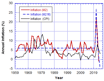
Chart 2 shows the CPI inflation by year (black dotted line). The very fact that the central bankers tell us they want to steal from us at a rate of 2% per year, and they say they will work to keep it in the range between 2% and 3%, also tells us that the credit (‘money’) creation via debt issuance from the banks is the cause of price inflation. But the 2%–3% target range has only been achieved 21.2% of the time.
Table I: Frequency of Annual CPI Inflation (1959 – 2023)
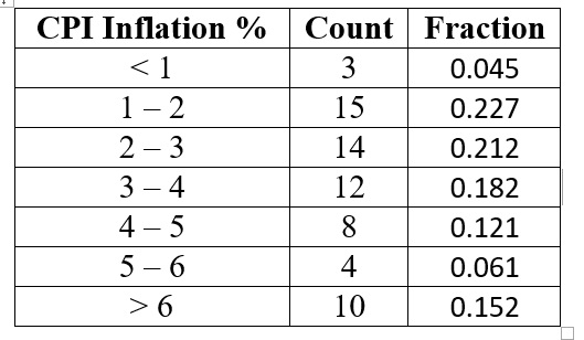
Only 21.2% of the time (years) was the 2%–3% target range achieved. Another 22.7% of the time the CPI inflation fell into the range 1%–2%, and a total of 27.2% of the time it was below the target range. Notably 51.5% of the time the CPI inflation rate was above 3%, hence above the target range.
The dollar devaluation from CPI inflation growth for a 1959 dollar, curve (3) in Chart 1, is significantly lower than curve (1) + (2) derived from the expansion of the M2 currency supply. According to officialdata.org the average CPI price inflation rate is 3.74% between 1959 and 2024. But as M2 currency supply growth would indicate to inflate $1 to $47 in 65 years you need an annual average inflation rate of 6%, about 1.6 times the official value. See dashed blue curve in Chart 2. Which is correct?
We make the claim that the official CPI inflation rate is incorrect and that there has been obfuscation to hide the theft that has been going on for the last 110 years. CPI inflation is a total fraud and the central bankers know it.
Therefore if the US CPI inflation rate officially hit 8% in 2022 it means that it really was at least 13% that year. But that is based on an average annualised rate, so year to year it could vary even higher than double official published data.
The official CPI annual inflation rate is lower than the M2 money supply rate of growth. The latter must have an effect on the purchasing power of the dollar. No doubt other factors contribute to the supply and demand issues that result in price inflation. But currency supply growth should determine the rate of dollar devaluation as Lord Mervyn King admitted. On average the latter is 60% higher than the official annual US CPI figures as seen in Chart 2.
The peaks and troughs seem to be anti-correlated, except in the period 2020-2022 when they appear correlated from the mad money printing years. This is evidence that M2 credit creation is a big contributor to CPI price inflation.

A correlation analysis shows little correlation (see Chart 3). In this test a χ2 = 0 shows perfect correlation. Yet as indicated in Chart 2 there is obvious correlation during the mad money printing years of 2020-21. This is evidence that M2 credit creation is a big contributor to CPI price inflation.
We could speculate that CPI inflation lags behind the growth in the money supply. See the periods 1971 to 1981 and 2020 to 2023 in Chart 2. CPI inflation peaks lag M2 currency growth rate peaks. This is because it takes time, possibly more than a year, for the added liquidity from periods of Quantitative Easing (QE), “money printing”, to work its way down to the consumer. It is their actions which determine CPI inflation (assuming no fudging of data). Thus these two measures of inflation could appear to be anti-correlated depending on the time lag.
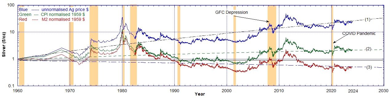
For further additional independent evidence that M2 money supply growth causes price inflation look at the false inflation of the price of gold. Gold is money and we expect its value should largely only change by devaluation of the dollar it is priced in.
I numerically adjusted the historical price of gold per troy ounce by the M2 currency supply dollar devaluation curve (1) + (2) in Chart 1 to normalise all dollars to 1959 dollars. Also I did the same using the CPI Inflation dollar devaluation curve (3) from Chart 1. Therefore we get the price of gold over time with the inflationary effects stripped out using these two methods and the results are displayed in Chart 4.
This results in the price for gold at $44/oz as of December 29, 2023, shown on Chart 4. On that day gold was sold for $2078/oz. Divide that by 47 for currency deflation and you get $44/oz. That is in 1959 equivalent dollars. That means gold has appreciated slightly in real value compared to its price of $35/oz in 1959. But if instead you divide by 10.88 for the government CPI deflation factor you get $190/oz in 1959 dollars, which means a significant increase from $35/oz in 1959.

After normalising or “de-inflating” the price of gold to 1959 dollars using the growth in the M2 money supply (red data in Chart 4) the overall background trend in the price shown is constant. Ignoring the peaks, it is apparent that there is no overall increasing or decreasing trend. That is, the red gold price data follow the solid straight line (1).
From this it follows that price inflation has been effectively eliminated from the price of gold. In an ideal world there should be no change in the real price of gold in non-deflating dollar terms. Gold is money. That is one 35th of a troy ounce of gold should be the definition of the dollar.
However normalising the price of gold to 1959 dollar using CPI inflation devaluation of the dollar (see green data in Chart 4), there still remains a strong rising trend. A linear curve fit to the result there is shown by the dot-dashed line (2). This means that price inflation has not been eliminated using CPI inflation data.
The method presented here is, that at least with the price of gold, inflation can be removed by normalising to 1959 dollars via the M2 currency supply growth but not via the official CPI inflation growth. Therefore the rate of growth of the M2 money supply is an accurate measure of real price inflation and can be used to strip out inflationary effects on the price of gold.
Below we do the same analysis with the price of crude oil.
Therefore the question is: How much can we say about suppressed interest rates? By artificially holding those down, it reflects in the CPI inflation rate, but not in the real inflation rate caused by ‘money printing’ and expansion of debt-based credit. In addition the CPI rate is manipulated, by, for example, excluding food and energy (gas, heating oil, fuel), so it does not correctly follow real consumer activity.
Finally we looked at crude oil prices ($/barrel) in 1959 dollars using the same technique (curves (1) + (2) from Chart 1) to put them into the same 1959 dollars and hence remove the inflationary effect of the expansion of the M2 money supply.
In Chart 5 we have plotted these oil prices from two different sources along with the price of gold ($/oz) in 1959 dollars. It was necessary to scale the oil prices to the initial value of $35/barrel in 1959 to display them on the same chart as gold. In 1959 the nominal price of oil was $3/barrel so the conversion factor used here is 35/3 = 11.67.

There is a discrepancy in the 1970s between the crude oil price data from the two different sources but they agree everywhere else. It is quite apparent though that the normalisation to 1959 dollars using the M2 money supply expansion curves from Chart 1 successfully removes all inflationary effects on the price of crude oil. Chart 5 shows that before 1973, when gold was finally decoupled as exchangeable for the dollar, the oil price precisely followed the price of gold. After 1973 there is a general similar trend and features during recessions are noteworthy.
Everywhere on this chart where the price of crude is below the $35 solid horizontal line indicates the price has fallen in real terms. Therefore after inflation has been removed the price of crude is cheaper now than it was in 1959.
If the CPI inflation rate dollar devaluation curve (3) of Chart 1 was used here the result would be similar to the gold prices (green) in Chart 4 where CPI inflation data was used. The price of crude would still display a rising trend as does the gold price when it is used. Some inflationary effects would still be observable.
We can conclude that official CPI inflation data do not genuinely reflect true inflation. It is fraudulent. The rate of growth of the M2 money supply is an accurate measure and can be used to strip out inflationary effects on the price of gold and even crude oil it seems. However due to the complexities of price inflation on other commodities it may be more problematic.
In conclusion, we can say that Lord Mervyn King was right on the money (pun intended) when he stated that COVID ‘money’ printing led to price inflation. We can also state unequivocally that the official CPI inflation data do not genuinely reflect true inflation. The Consumer Price Index inflation is total fraud.
Addendum added 01/02/2024
One more commodity is worth a comparison and that is the price of silver where the effects of inflation have been stripped out using the two different dollar devaluation models, M2 currency supply and CPI inflation.
On Chart 6 curve (1) is an exponential fit to the historical silver price data. Curve (2) is a linear fit to the “de-inflated” silver price in 1959 dollars calculated using the official CPI inflation data. The linear fit (2) has a positive slope of $0.30/year. Curve (3) is a linear fit to the “de-inflated” silver price in 1959 dollars calculated using the M2 currency supply. The linear fit (3) has a negative slope of -$0.11/year.
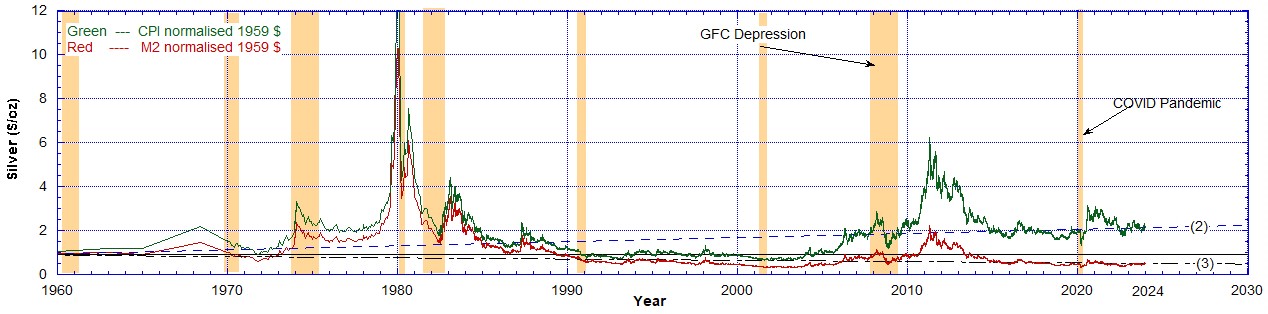
Chart 7 reproduces the “de-inflated” silver prices from Chart 6 for the 2 models used. If you consider only data after 1990 the M2 corrected silver price red data have no trend if you ignore the peak around 2012. However the silver price green data corrected with CPI Inflation still have a rising trend line after 1990. The dashed curve (2) has a positive slope. If the effects of inflation were stripped out it should ideally have no slope.
Similarly to the gold price in Chart 4 the CPI Inflation data in Chart 6 fails to strip out the effects of inflation on the silver price.
Recommended Reading
- Book: Apocalypse Now: On the Revelation of Jesus Christ
- Book: Merchants of Death: Global Oligarchs and Their War On Humanity
Follow me
- Telegram.org: @GideonHartnett
- Facebook: Gideon Hartnett
- X (Twitter): @gideon195203

To be notified by email put your email address in the box at the bottom of your screen. You’ll get an email each time we publish a new article.

Click this image to make a secure Donation (Stripe) !