

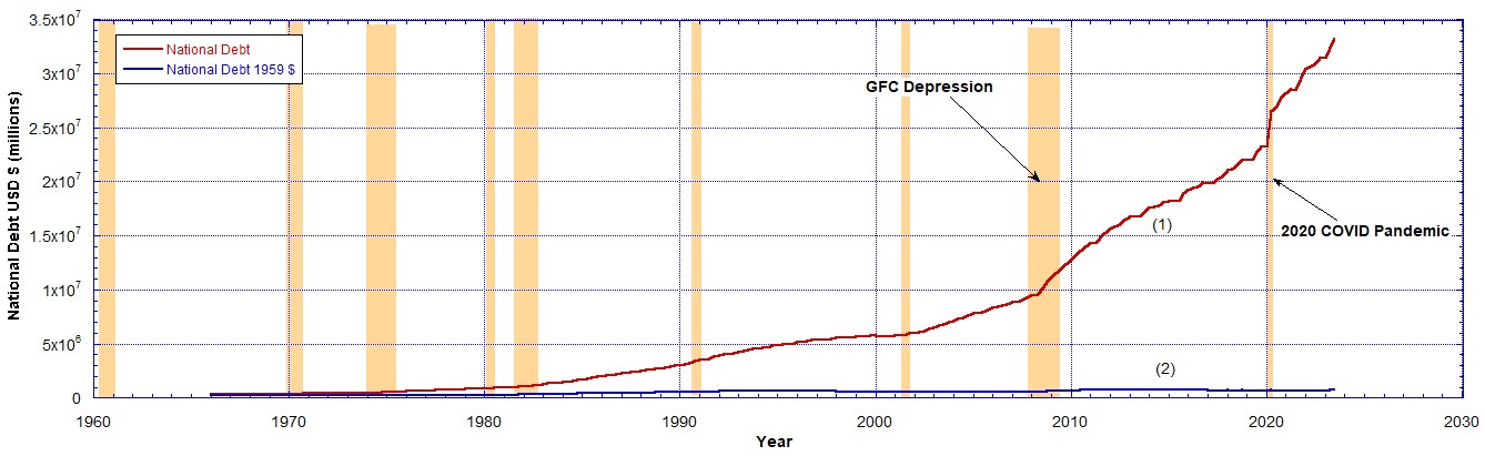
The United States Total Public Debt or the National Debt has reached $34 Trillion. The red curve (1) in Chart 1 shows its accumulation since 1966. Note the two rapid increases after the 2008 GFC and the 2020 COVID pandemic. These are important to understanding any correlation with gold and silver prices. In this piece I want to answer the following question. What can the US National Debt tell us about gold and silver prices? Can it predict their break out?
Using the dollar deflation derived from the M2 money supply growth we can strip out the effects of inflation. This was shown in The CPI Inflation Rate Compared to the M2 Money Supply Growth.
Below the same data from Chart 1 are shown in Chart 2 on a log-linear plot.
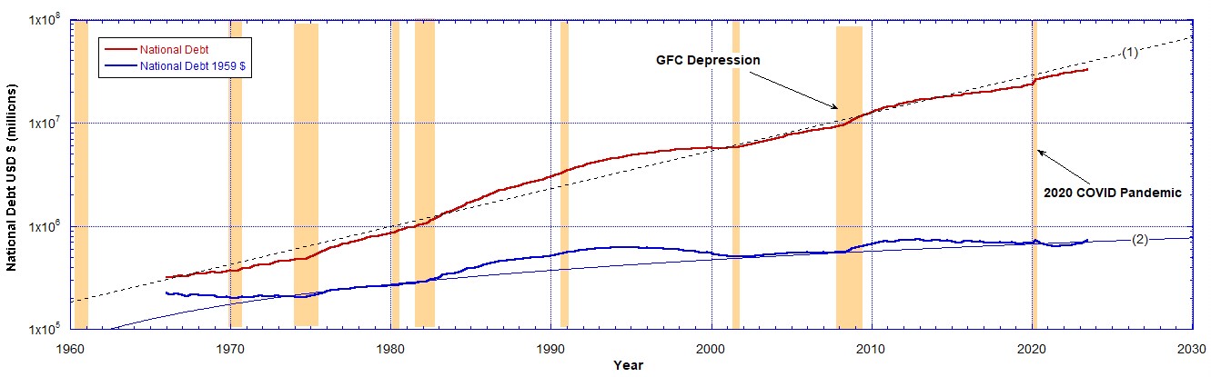
Chart 2 shows more clearly the trends associated with the accumulation of the debt as a function of time. Curve (1) is an exponential function and curve (2) is a linear function. After stripping out the effects of inflation using the devaluation of the dollar as determined from the M2 currency supply we get the blue data, the National Debt in 1959 dollars. Now we are comparing “apples with apples”. This is reproduced in Chart 3.

In Chart 3 we see two significant humps centred on 1994 and 2012; the two periods when the National Debt was massively increased.
What happened in the 1990s and the 2010s that suggest a big increase in real terms in the National Debt? That was followed by periods where the debt was paid down a little. It is this general shape of the debt that we need to look for when comparing it to the growth in the prices of gold and silver.
In the following we use the National Debt in 1959 dollars (blue curve in Chart 3) compared to the normalised gold price (Chart 4) and the normalised silver price (Chart 5).

Before 1970, as far as the data show, the National Debt with inflation stripped out is tightly correlated with the price of gold. Between 1973 and 1990 there seems to be a general correlation if we ignore the peaks. After 1995 the normalised National Debt data is quite well correlated with the price of gold.

The National Debt with inflation stripped out displays similar correlations with the price of silver as it did with the price of gold. The gold price shows stronger correlation.
In Chart 6 both gold and silver prices are shown on the same chart with the National Debt using 1959 dollars. The silver price and the National Debt are scaled so they can be shown on the same chart, as described in the caption.

Before 1970 the National Debt and the gold price are correlated as much as the limited data show. The silver price is not so well correlated. This may have something to do with the fact that silver has not been a monetary metal since 1873 with the passing of the Coinage Act. After that it lost some of its “moneyness”.
From 1970 to 1995 we see a strong rise in the National Debt, in fact it peaked in 1994. Over the same period we see a strong rise in the price of gold after Nixon decoupled US dollars from being exchangeable for gold. The silver price closely followed the gold price, which means it is still being valued as a monetary metal.
After the gold window was closed in 1970 up to 1995 there may have been a reaction to going off the gold standard. The prices of gold and silver displayed strong rallies and sell-offs not reflected in the National Debt levels, though the overall increasing trends are the same, if we ignore the peaks.
From 1995 to 2023 we see a correlation between the National Debt and the price of gold and of silver. As the debt falls the precious metal prices fall and as the debt rises and falls again we see the same trend in the precious metal prices. Thus an increase in the National Debt in real terms goes with an increase in the metals’ prices, all priced in 1959 dollars.
After 2021 the National Debt began increasing significantly and is correlated to the rise in the real gold price. This is clearly seen in Chart 4 on linear axes. Therefore we can predict the real price of gold will increase proportionally to the National Debt. To convert it to the current dollars we only need to multiply that by the amount of devaluation of the dollar since 1959.
From that it follows that the gold price (red data labelled (2) in Chart 4) must break out of the triangle it is being squeezed into with apex in May 2026. And it must be a positive increase as the National Debt will never decrease again, not even when the dollar dies.
The same is true for silver (green data labelled (2) in Chart 5). Above 2021, though the silver price increase is not so pronounced, there is the same correlation with the rise in the National Debt. The silver price will also break out of the triangle it is being squeezed into with apex in June 2025. And it must be to the upside because the National Debt can never decrease again. It must increase in real terms as priced in the same 1959 dollars.
From a human action stand point this makes sense. As the National Debt was increased in real terms after the 2020 pandemic more buyers entered the market buying gold and silver to protect their wealth from what they fear is coming, that is, that the market may break leading to the crack up boom. This may be more clearly seen in the period after 2008 (GFC depression). A strong rise in the metals prices when the National Debt was rapidly increased.
A similar reason could be argued for the 1970 to 1995 period. Uncertainty after the decoupling from gold caused many to speculate in the metals market at the same time the National Debt was being expanded to fund the military industrial complex and bigger government. A result of closing the gold window was a lot more currency printing.
In conclusion, I believe we can safely predict that gold and silver prices must break out to the upside within roughly 2 years. But could happen before. The gold price reaches its apex near the middle of 2026. The metals’ prices must break out to the upside because they are correlated with the National Debt that must be increased, never decreased. It is impossible to decrease it, before the dollar dies.
Related Content
- The CPI Inflation Rate Compared to the M2 Money Supply Growth
- When Gold’s Real, Uninflated Price Breaks Out
- What is Money? Who Controls It?
- World War III Has Begun (at Least Against the Currency)
Recommended Reading
- Book: Apocalypse Now: On the Revelation of Jesus Christ
- Book: Merchants of Death: Global Oligarchs and Their War On Humanity
Follow me
- Telegram.org: @GideonHartnett
- Facebook: Gideon Hartnett
- X (Twitter): @gideon195203

To be notified by email put your email address in the box at the bottom of your screen. You’ll get an email each time we publish a new article.

Click this image to make a secure Donation (Stripe) !


One response to “The US National Debt Predicts Gold and Silver Price Break Outs”
I simply want to say, ‘Thank you’ John for all your research and efforts in posting the information you do. Sometimes, that takes great courage. With kindest regards, Mrs. Jane Blakey.
LikeLike