Previously I reported on the US National Debt which has now reached about $34 Trillion. At the end of 2023 US gross domestic product (GDP) reached nearly $28 Trillion, which means the National Debt is about 120% of GDP.
For comparison 20 years ago, the U.S. debt-to-GDP was 56%, approximately half of what it is now. The previous record high was 118% in 1946, following the heavy expenses associated with World War II. We are back at that same situation and we are currently in World War III. See World War III Has Begun (at Least Against the Currency).
In the following charts I show the National Debt compared to the nominal historical prices of gold and silver. The National Debt has been scaled so that it may be presented on the same Chart as the precious metals’ prices.
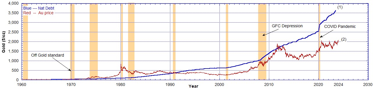
Chart 2 is the same data as chart 1, but on log-linear axes.
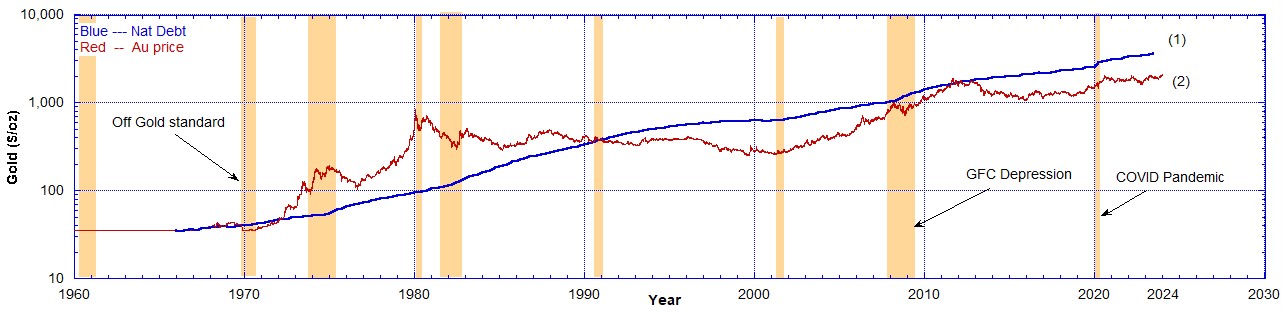
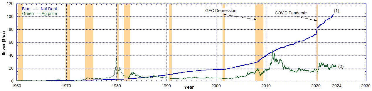
Chart 4 is the same data as chart 3, but on log-linear axes.

Finally both gold and silver prices are presented on the same chart as the National Debt. Also it was necessary to scale the nominal price of gold per oz by 1/35.1 to bring its price to $1 in 1966 so it may be presented on the same chart as the nominal price of silver ($0.92 in 1960 and $1.30 in 1966) and the National Debt scaled to $1 in 1966. The price of gold per oz from 1934 to 1967 remained at $35.1 hence between 1960 and 1966 it remained at this level. See Chart 6. Only after the closure of the gold window in August 1971 did the gold price rapidly increase.
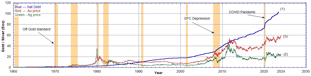
Chart 6 is the same data as chart 5, but on log-linear axes. From 1990 the growth in the National Debt outpaced the price of gold and silver.

Chart 5 shows us that silver is undervalued compared to gold by a factor of approximately 2. Compare curves (3) and (2). But the National Debt increase is about 175% the increase in the price of gold since 1966. Compare curves (1) and (3). It has outpaced gold’s price increase by 75% in 58 years. In other words since 1966 the price of gold has risen 60x but the National Debt has risen 105x.
Gold is money, everything else is credit. This is appalling when you consider how indebted the United States taxpayer is. And the last time this happened was in World War II. Personally I would not want to be so indebted but rather have my assets in real stuff.
Recommended Reading
- Book: Merchants of Death: Global Oligarchs and Their War On Humanity
- Book: Apocalypse Now: On the Revelation of Jesus Christ
Follow me
- Telegram.org: @GideonHartnett
- Facebook: Gideon Hartnett
- X (Twitter): @gideon195203

To be notified by email put your email address in the box at the bottom of your screen. You’ll get an email each time we publish a new article.

Click this image to make a secure Donation (Stripe) !