

In my piece US National Debt Predicts the Next Big Financial Crisis I wrote that the US National Debt may be predicting the next big financial crisis in July 2025, only 8 months from now. That was based on the rapid increases in the National Debt during times of past crises. But is there any other evidence to support that prediction?
First recapping on what I previously found.
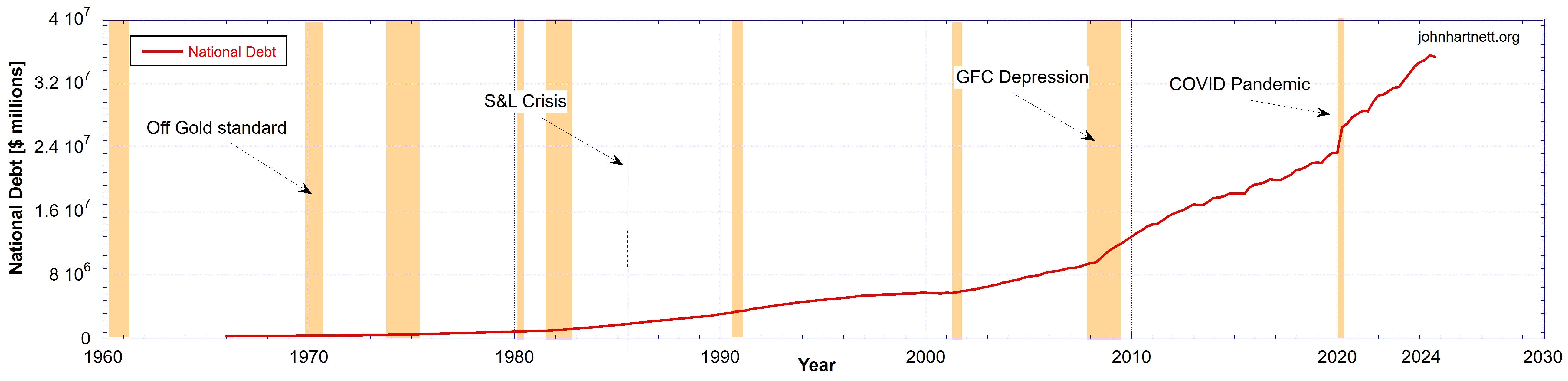
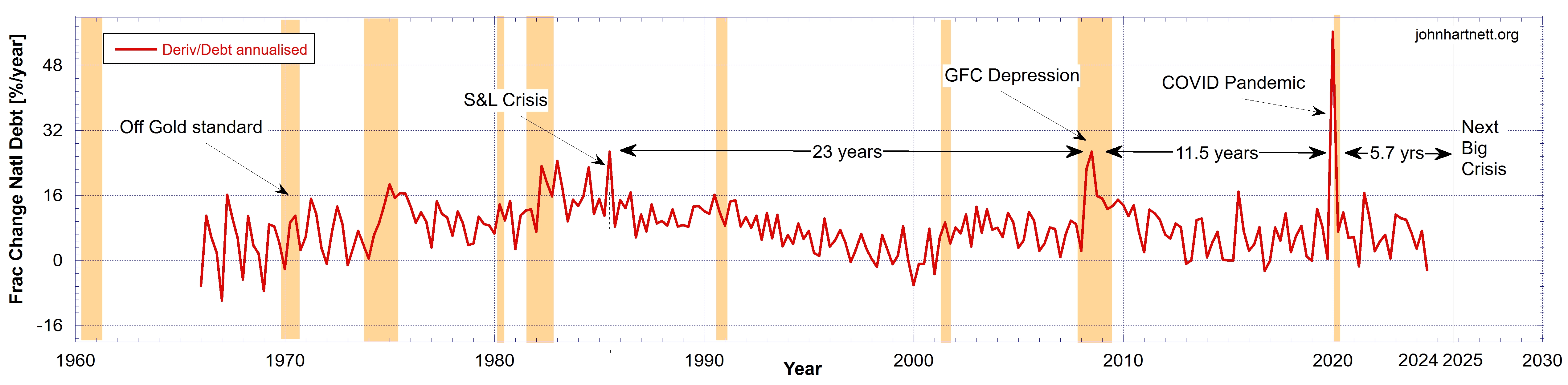
The US National Public Debt (Chart 1) shows 3 significant periods of financial crisis: the 2020 COVID Pandemic, the 2008 Global Financial Crisis (GFC Depression), and the Savings and Loan (S&L) crisis. But the latter is not easily seen until you look at the fractional change in the National Debt. See Chart 2 below expressed as an annualised percentage.
The question is, how robust is that prediction? Is it seen in other monetary data?
In the following I have added the rate of change seen in both the US Monetary Base and the price of Gold.
By taking the fractional rate of change (1/x)(dx/dt) and not the rate of change (dx/dt) of some parameter x, we compensate for the effect of deflation of the dollar over time. In this way inflationary effects are stripped out and we are thus comparing “apples with apples”.
Previously I noted that from the S&L crisis there is a halving in time between or a doubling in frequency of these financial crises. If true, the trend predicts the Next Big Crisis in July 2025, 5.7 years after the last one in January 2020. See Chart 2.
I mentioned this to Chris Marcus of Arcadia Economics and he quoted the soon-coming Treasury Secretary who said:
“I do believe this election, there’s a big choice. And we are going to decide whether we are going to grow our way out of this debt burden. And I think we can through deregulation, energy independence and dominance in the US, and a growth mindset.
We can get back to growth.
I feel very strongly that this is the last chance to grow our way out of this.
I also felt very strongly that we’re in the midst of a great realignment, and of a Bretton Woods realignment coming, in terms of global policy, global trade. A lot of what I taught at Yale, and what I’ve been studying my whole life.
I’d like to be part of it either on the inside or the out.”
Scott Bessent (from this video at 54.56 mark)
Could this be an acknowledgment of the problem that is already here?
Chris Marcus also questioned whether “Gozer the Gozerian nears?” But Rafi Farber of the Endgame Investor wrote that “Gozer was banished to the nearest convenient parallel dimension back in 1983. It’s on record.”
Well, humour aside, Rafi Farber suggested a comparison with the US Monetary Base and the price of Gold. This I have done in the sequel here.

Chart 3 shows the Monetary Base in billions of dollars since 1960. Quite obviously the credit expansions are very significant from 2008 (the GFC) and 2020 (the COVID Pandemic).
By taking the gradient of this blue curve in Chart 3 we get the result in Chart 4 where I have expressed the rate of change of the Monetary Base as a annualized percentage. That is a year-over-year rate if sustained for the whole year. Thus this is a true measure of dollar deflation as the money supply is expanded or contracted.
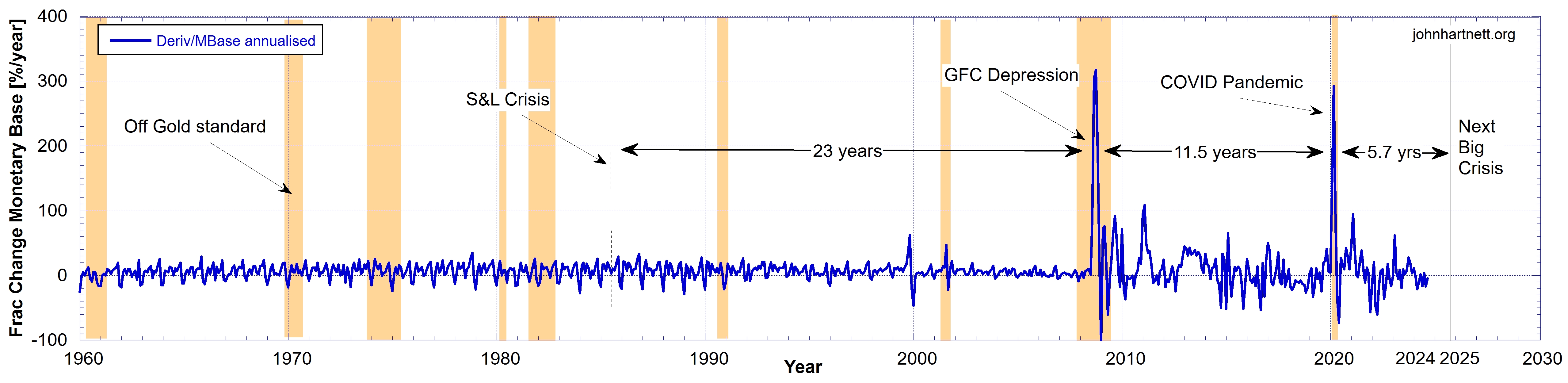
For example, the percentage change of the Monetary Base in 2020 is about 292% in March but over a 1 month time sample. Because it is annualised, divide by 12 and you get 24.3% for that month at the peak value. That was when the helicopter money was raining down its strongest.
The S&L crisis is not seen on Chart 4, but there is a rapid increase in the Monetary Base in November 1999 and 2 months later, a rapid drop in January 2000. The dot-com bubble burst in March 2000, with the technology heavy NASDAQ Composite index peaking at 5,048.62 on March 10 (5,132.52 intraday), more than double its value just a year before.

On Chart 5 I compare the fractional change in the Monetary Base with 4x the National Debt. The scale factor of 4 is used to enhance the National Debt so it is more easily seen on the same chart.
Excellent agreement is found in the timing of the 2008 GFC and the 2020 Pandemic crises. But that is expected. No surprise there.
Chart 6 presents the ratio of the US Monetary Base to the US National Debt, where both were sampled quarterly. Because the Monetary Base was in nominal terms much lower before 1990 than after 2007, taking the ratio has the effect of enhancing the magnitude of the monetary base at the lower end.

The S&L crisis is just visible in this modified Monetary Base data because the information is in the National Debt data, which is in the ratio here.
Again I have calculated the fractional rate of change but this time for the ratio of the US Monetary Base to the US National Debt, and the result is shown in Chart 7.

The S&L crisis is just visible, but because it is in the National Debt data. The GFC and Pandemic crisis are very clearly shown here. In fact, from 2008 to 2022 there are many periods of rapid expansion of the Monetary Base. These of course occurred with quantitative easing (including QE I, II, II and IV) credit creation to keep inflating the currency, during what looks like a rolling decade or more of crises.
The following Chart 8 shows the fractional rate of change in the Gold price since 1960.
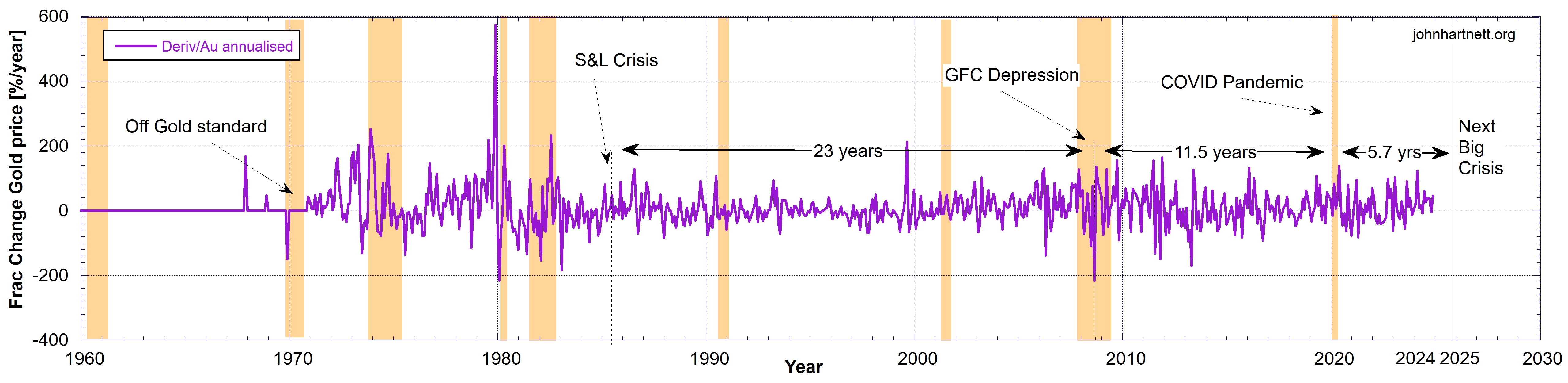
The same crisis periods are seen along with several others. The 1970s and 80s relate to the closing of the gold window. In 2008 the gold price rapidly dropped. This is easily seen in Chart 9 compared to the rapid rise in the Monetary Base. Zoom into the period around 2020 and you’ll see the gold price rose as the monetary base decreased. That is also very obvious in 2012.

Right now we see the price of gold increasing as it did in past recessions and depressions. The ratio of the Monetary Base to the National Debt initially rose then decreased in the recessions. At the same time the price of gold rose rapidly.
We don’t yet have the 3rd quarter data for the Monetary Base and the National Debt but current indications are that tightening is continuing. These conditions look very similar to 2007 heading into the GFC.
But what can we really say from all this in regards to the future?
If there was a massive expansion of the monetary base in July 2025 with a rapid drop in the gold price we would be in the Next Big Crisis. But unfortunately the whole pattern in the National Debt is not seen in the Monetary Base except the 2008 GFC and the 2020 Pandemic crises. We’d need a 3rd crisis in the series to establish a solid prediction for 2025.
Perhaps Gozer the Gozerian is about to break out of that parallel dimension as the dollar dies?
Related Reading
- US National Debt Compared to Gold and Silver Prices
- The US National Debt Predicts Gold and Silver Price Break Outs
- Is the Gold-to-Silver Ratio Predicting Another Great Depression?
Subscribe
Free
To be notified by email put your email address in the box at the bottom of your screen. You’ll get an email each time we publish a new article.

Premium
Subscribe to our Newsletters as a Premium member ($5 USD/month or $30 USD/year) and get a free PDF of my book Apocalypse Now, which you can download from a Premium members only post here.
Paid Premium members will get exclusive access to certain content I publish, which I expect to be about 4 exclusive posts per month.