
I believe that most of the public do not understand the true source of real price inflation. My last piece I wrote was on the prices of gold and silver compared to their prices if they were only inflated by the amount of inflation determined from the expansion of the M2 money supply and the so-called Consumer Price Index (CPI). Read How are Gold and Silver Performing Against Real Inflation?
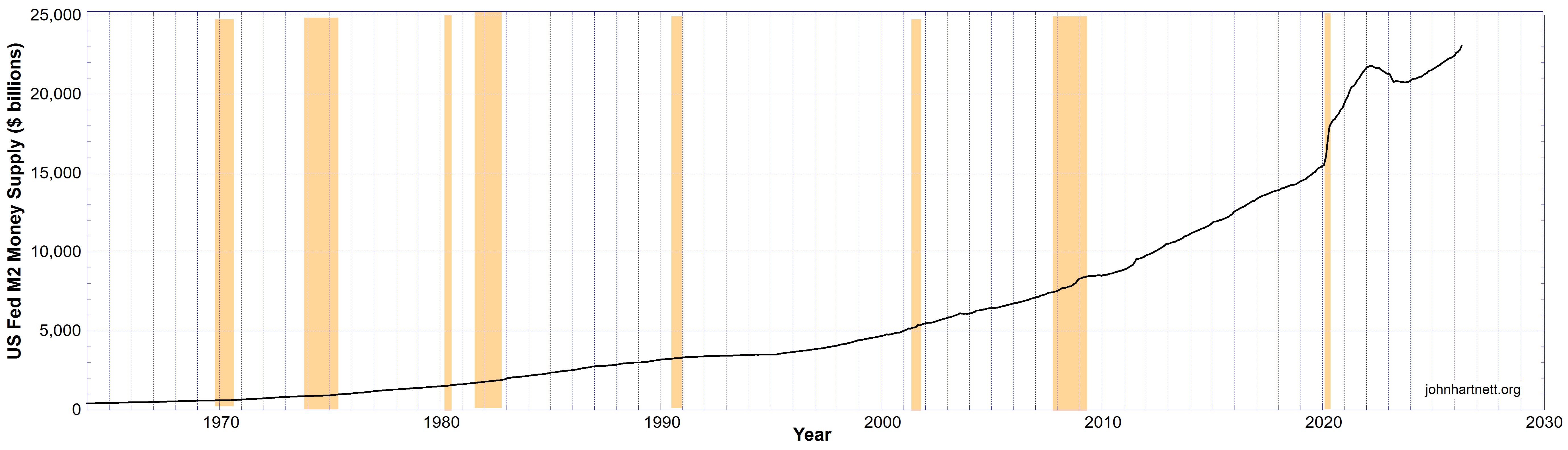
After posting that I thought I’d have another look at what inflation might look like if it was calculated directly from expansion of the US Federal Reserve M2 money stock. Chart 1 shows the M2 money stock as a function of time from 1964 as published by the St Louis Fed.
To calculate a value for inflation from this I took the first derivative of the monthly data expressed as a fraction of the prior month and converted to a percentage. That is the monthly inflation shown as light blue curve (1) in chart 2 below. Note it is not annualised.
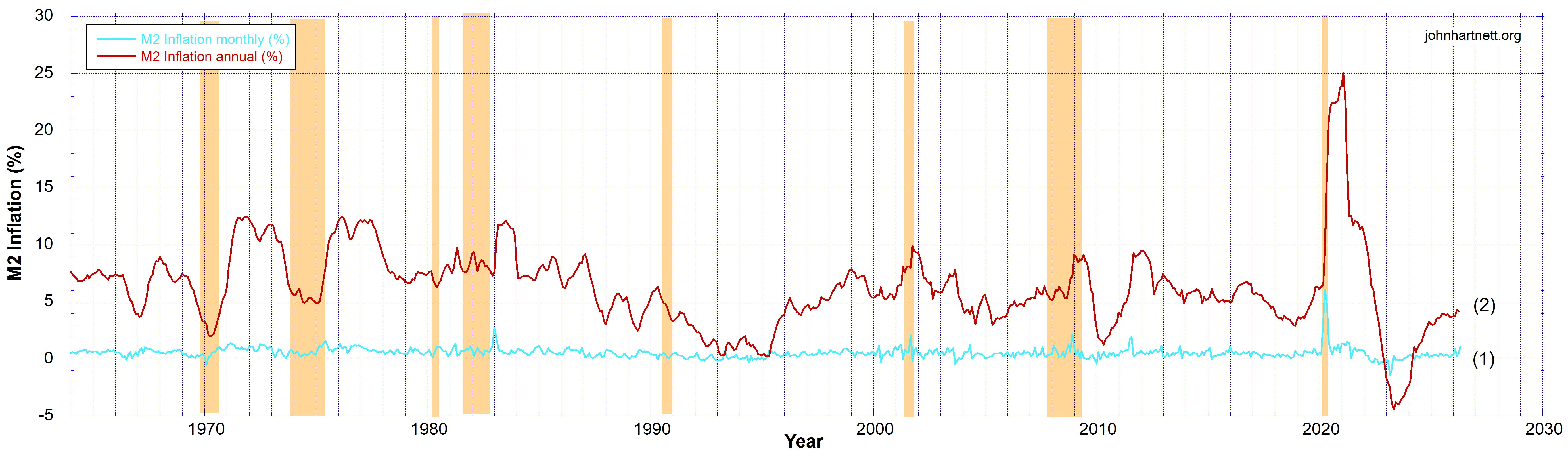
The red curve (2) in Chart 2 represents my calculation of the annual inflation from the M2 money stick. Since the M2 data was sampled monthly each point represents the inflation period for the 12 months prior to that point. That then suggests that there is no delay in affecting prices more than from that prior 12 month period. I don’t know if this is a good assumption. Probably not. But it gives us a quantum of the real magnitude of inflation resulting from dollar devaluation by the central banks. Definitely the CPI cannot reflect real inflation when the source of price inflation is actually the amount of circulating currency and credit.
Some statistics on the annual inflation data (2) in chart 2, over the past 62 years:
- Medium 6.073% p.a.
- Mean 6.223% p.a.
- Standard deviation 3.520% p.a.
Over the time shown the true value of inflation has been mostly well above the Fed target range of 1% p.a. to 2% p.a.. It has mostly varied between 2.7% p.a. and 9.7% p.a.. To reach the Fed’s target they would have to reduce their currency and credit expansion rate by a factor of 4. But to keep the economy from going bust they have to continually keep expanding it, inflating it faster and faster. And that means the dollar is being devalued concomitant with that.
You’ll notice in chart 2 that towards the end of each depression or recession (as indicated by the sepia strips in my charts) there is a big uptick in M2 inflation. That is usually followed by a big downturn in inflation. In 1974 that led to another recession. The cycle just repeats. But in 2020 when the Fed printed $3 trillion in “helicopter money”, inflation spiked to 25% p.a. by the end of that year. And by 2023 inflation fell to zero and then went into deflation for all of 2023. Since then it has steadily climbed up to around 4% p.a..
So why would you keep your money in the bank when you’d always be getting an interest return well below the figures of inflation shown on Chart 2? That means a real negative return on your money in the bank when real inflation is taken into account.
Physical gold and silver are not devalued away to nearly nothing like all fiat currencies always are. And eventually all fiat currencies go to zero. Always have and always will.
For this reason the precious metals are a better investment for most of the time. They may not return a dividend or interest but they don’t devalue to zero, well, not this side of heaven, anyway.
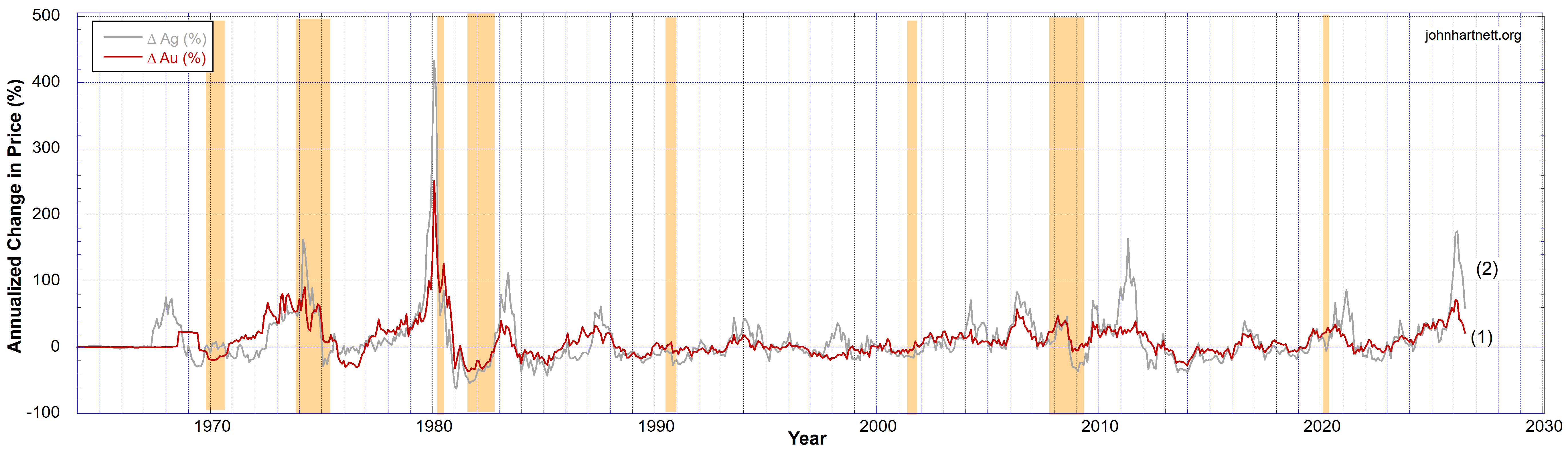
To get some sort of figure of merit for the performance of the prices of gold and silver I took their prices, sampled monthly, and calculated the price change in percentage terms for the 12 months prior to each datum. The result is shown in chart 3.
What interests us most is the latest data for 2026. There we saw the silver price increase from 28% to about 175% over the 12 months prior to January 2026. That was what some called a “parabolic” rise. It was probably more exponential. But by July 2026 it fell back down to a 59% increase. However in the same period the price of gold rose from 39% to about 72%, a much more modest rise, but it had been doing so for some time before that. By July 2026 it fell back down to a 22% increase.
Silver had 5 notable years where its price spiked up very rapidly. They were 1974, 1980, 1983, 2011 and 2026 (which includes much of 2025). In fact chart 3 shows how volatile silver has been compared to gold. Gold’s price has not fluctuated as much to the positive and negative sides of the zero percent line.
Year 2026 looks very similar to 1974, 1980, 1983 and 2011. Except for the massive spike in 1980, the other 4 years look almost the same in terms of quantum. So what comes next for gold and silver? Well, we don’t know from any historical chart. Hindsight only works on the past.
The biggest financial scam of the last century or more has been central bank credit creation and fiat money printing. They “print” it out of thin air. It’s a racket, a fraud, which should be outlawed but it is under US law. In 1913 the legislation was passed by the US Congress to form the Federal Reserve wherein they gave them a licence to print free money. What we have today is the result of that.
Related Reading
- How are Gold and Silver Performing Against Real Inflation?
- The Fed Liabilities Show That WWIII Will Be the Mother of All Wars
- World War III and Coming Depression
- Arcadia Silver Report | How High are Gold and Silver Prices Going?
- World War III | Gold and Silver Prices Will Also Explode
- The Great Taking: How Central Banks Could Seize Your Wealth
Free Subscribers
Subscribe to our Newsletters as a Free Subscriber and be notified by email. Just put your email address in the box at the bottom of your screen.
You’ll get an email each time we publish a new
Premium Subscribers
Subscribe to our Newsletters as a Premium Subscribers at $5 USD/month or $30 USD/year (you choose). Cancel anytime.
Paid Premium Subscribers will get exclusive access to certain content I publish. That will only cost you a cup of coffee per month.
Also you’ll be able to download, for free, a PDF of my book Apocalypse Now and also a PDF of my book The Physics of Creation The Creator’s Ultimate Design for Earth.
You can download them from the link below.
This is how you can support my work. I have been publishing this website for 10 years now and up to 2024 I never asked for any support.
Press the button “Premium” on the front page to find a list of Premium content. Thanks so much to all supporters.
At a minimum, please join as a Free Subscriber. It’ll cost you nothing. It may also help me beat the shadow banning of some posts.






Leave a Reply